

Growth-focused design of a loyalty feature for members
Overview
My Best Buy Total and Plus are membership tiers customers can join for exclusive perks, including member deals, free shipping and protections for their tech. While members generally enjoy their benefits, they do not have a reason to make use of them on a regular basis. Enter Member Picks.
What's a "pick"?
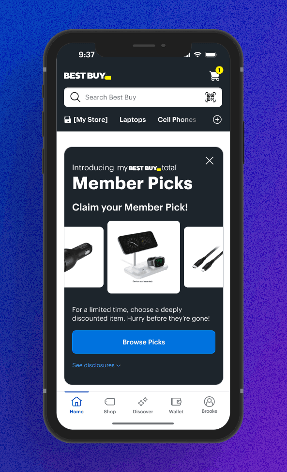
Member Picks are an assortment of products that Best Buy offers its members at a deeply discounted price– up to 80% off. Member Picks come and go on a monthly basis to keep customers intrigued.Best Buy offers a tiered membership program called My Best Buy Memberships™, with different levels of benefits and costs
Vision Statement
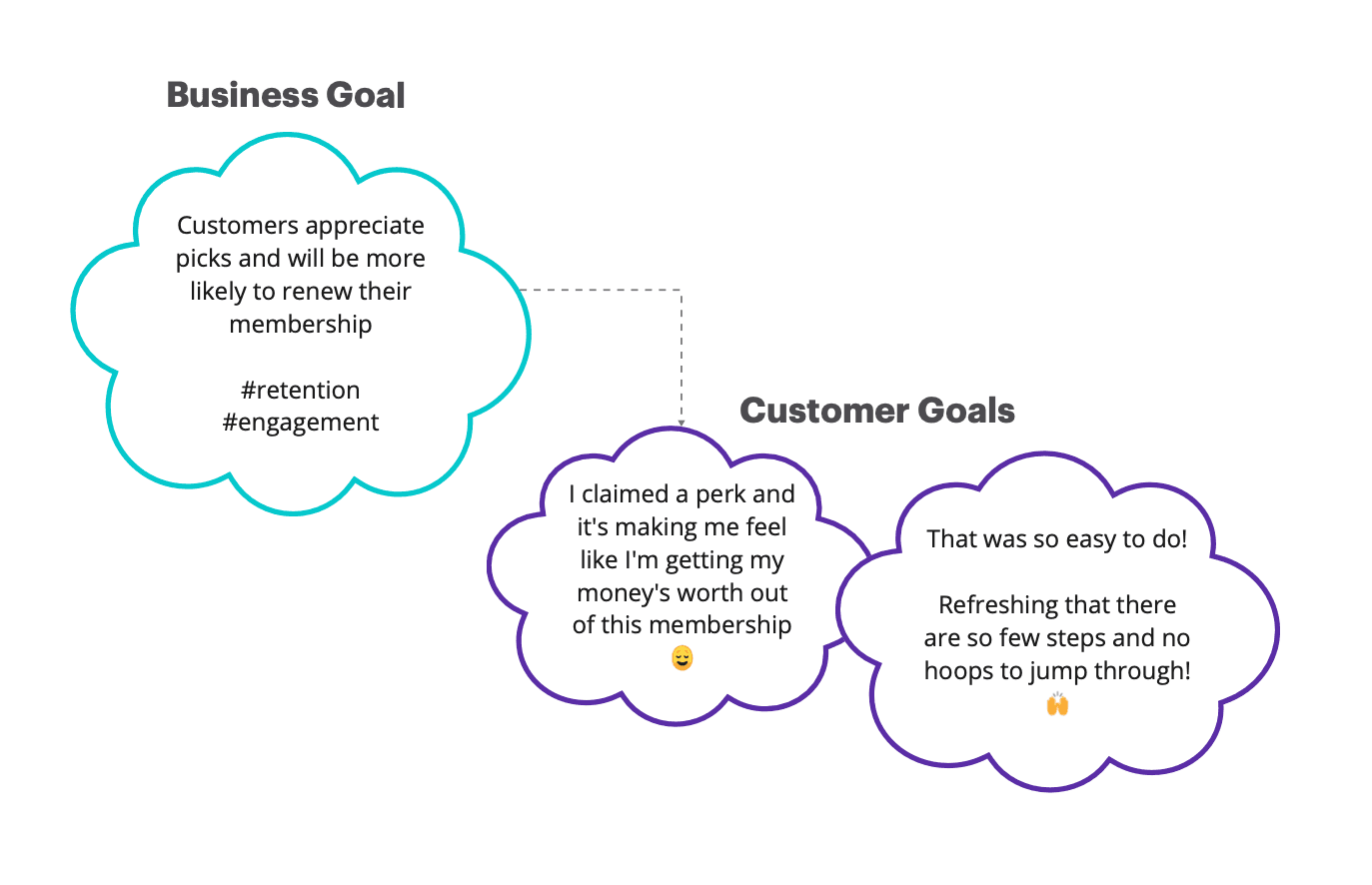
Today, My Best Buy Members get immediate value and usage out of their membership when they buy deals, redeem certs, and make use of their protections.
This falls short of a delightful member experience, because a lot of time may pass before they see any overt value from their membership.
We envision a world where members feel appreciated. We're bringing this about by giving members deeply discounted items on a regular basis.
Initial Product Requirements
At the start of the project, the product team outlined high-level business requirements, focusing on offer availability, fulfillment, and app experience. While these covered core functionality, several key UX considerations were missing.
What was clearly defined:
Offer eligibility for Plus and Total Members
Monthly reset of offers
App-first experience with activation in the Membership profile
Modular carousel component for offer discovery
What was unclear:
User Experience Constraints – No documented risks around usability, personalization, or friction points.
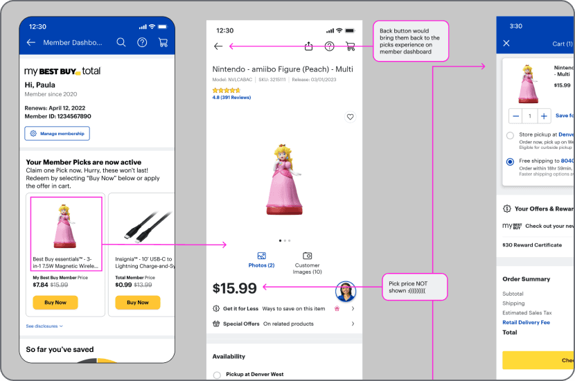
Redemption Flow Gaps – No add-to-cart option, leading to a disruptive “Buy Now” experience.
Lack of Personalization – No ability to tailor offers based on member behavior.
Limited Visibility of Offers – No integration with Product Detail or Product List pages.
No Expiration or Availability Indicators – Users couldn’t see how long an offer lasted or stock levels.
How I adapted
Despite these gaps, I worked within the constraints to advocate for usability improvements, ensuring a smoother member experience. In future iterations, I would recommend a more integrated UX discovery phase early in the process to refine requirements before moving into design.

The initial version included:
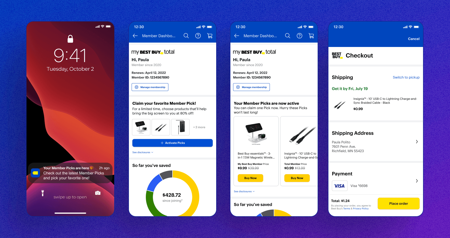
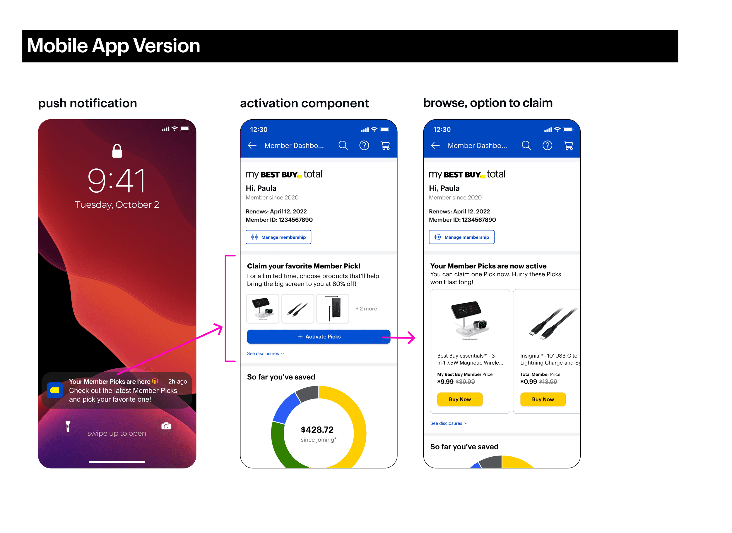
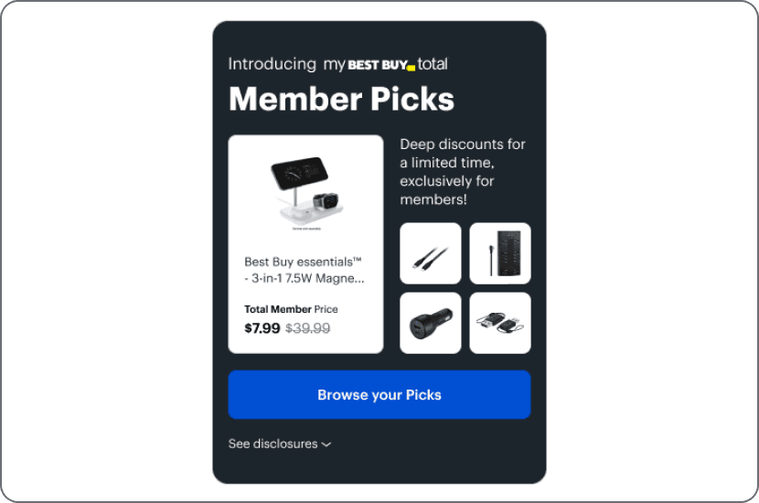
A notification to alert users that Picks were available
At this time, Picks were only available on the member dashboard, so this notification took them straight there.
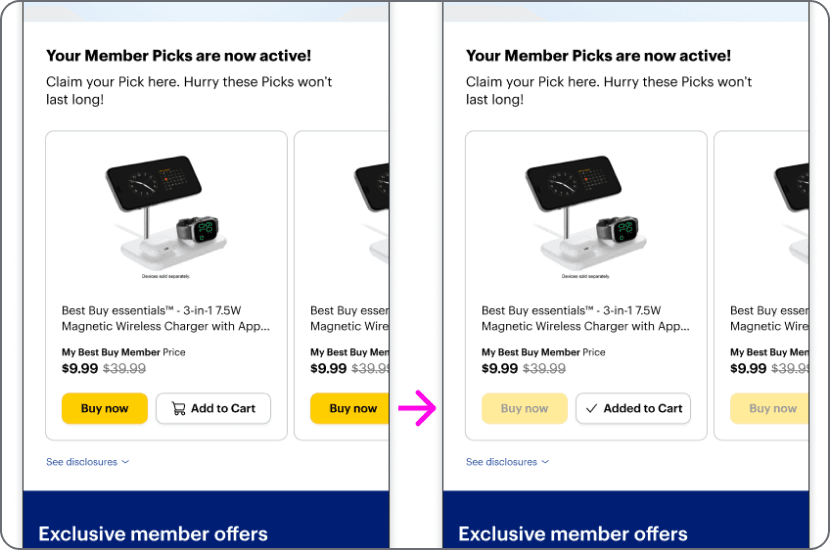
Activation step first which activates all Picks
Activation is a step which A) indicates to us that users are intrigued and interacting, and B) associates their user ID with the product they choose
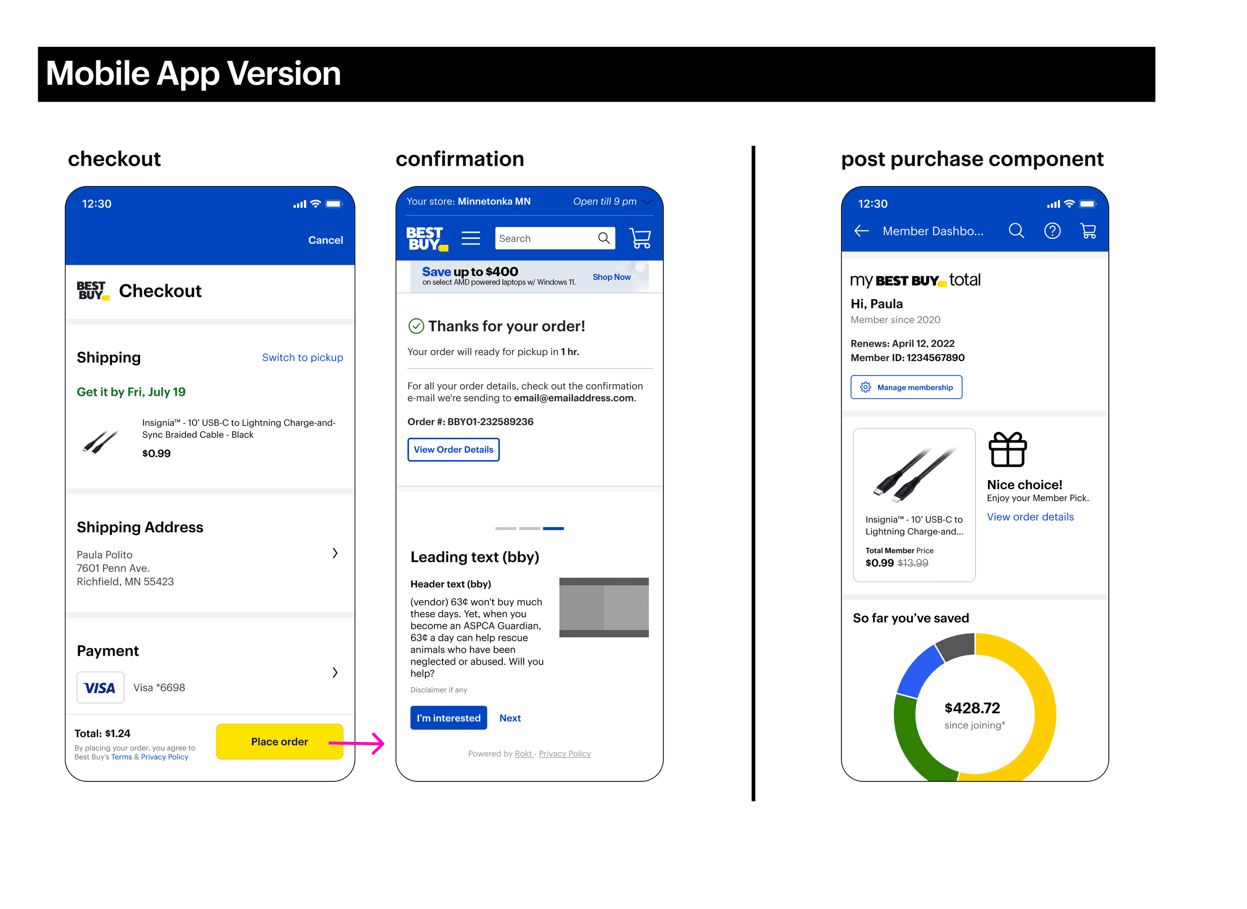
User can buy now only (no add to cart)
Post purchase message
Affirms with the user that the purchase was made
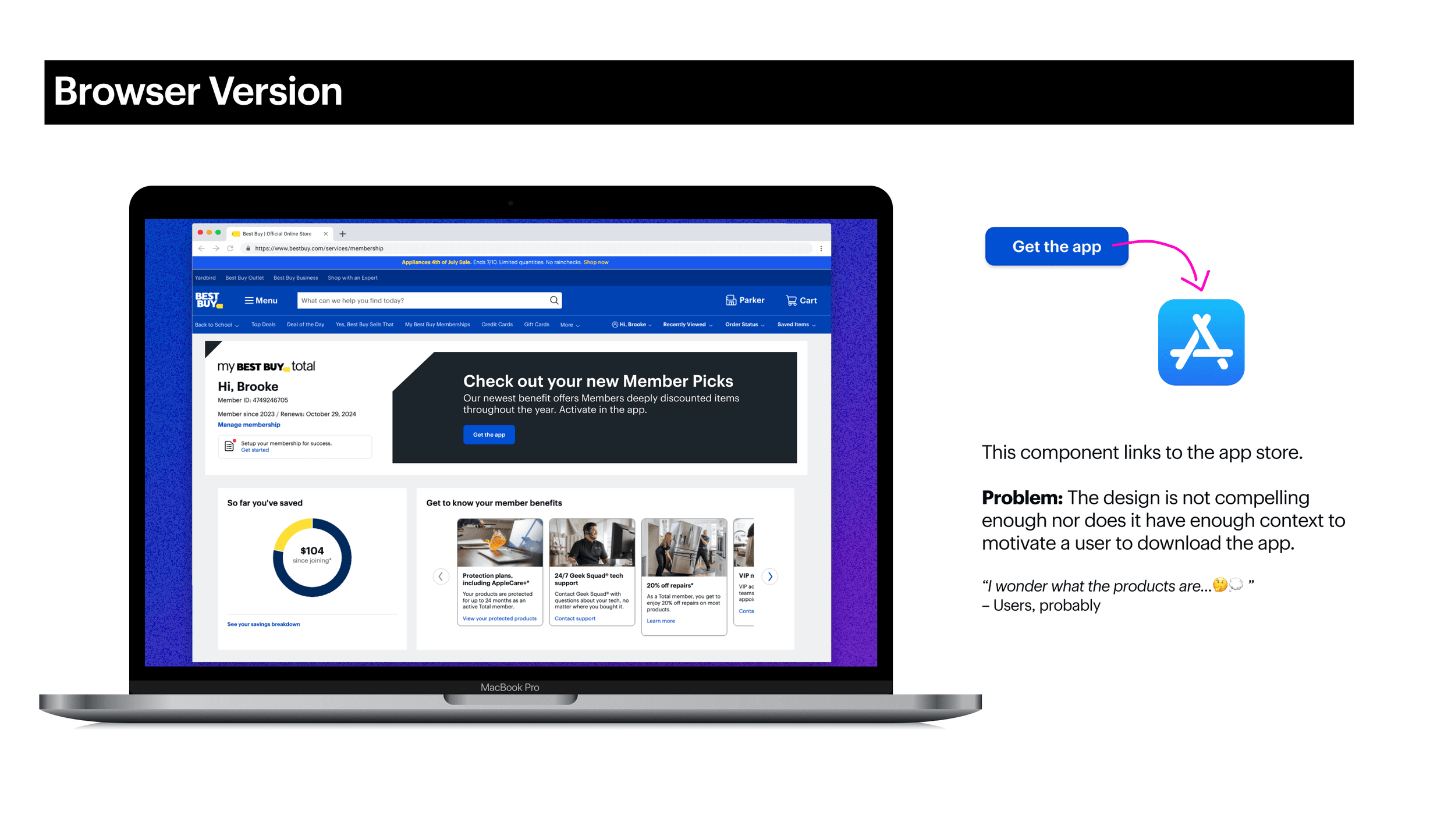
Small and large browser designs that direct user to the app (Picks are only available in app)
MVP Limitations & Challenges
While the MVP launched successfully, several limitations impacted the user experience:
No Add to Users could only "Buy Now," which created friction:
Many users shop for multiple items and may want to add Picks to an existing cart.
The ‘Buy Now’ flow disrupted their experience, especially as Picks expanded to pages like Global Home Page and Top Deals.
No Timer or Expiration Indicator – Users had no visibility into how long Picks would remain available.
No Availability Status – Users couldn't see how much stock was left, leading to potential frustration.
Browser Designs Lacked Engagement – The non-app experience wasn’t visually compelling or motivating.
Price Visibility Limitations – The Pick price was only visible in the component itself, not reflected on the Product Detail Page (PDP) or Product List Page (PLP), which created inconsistency.


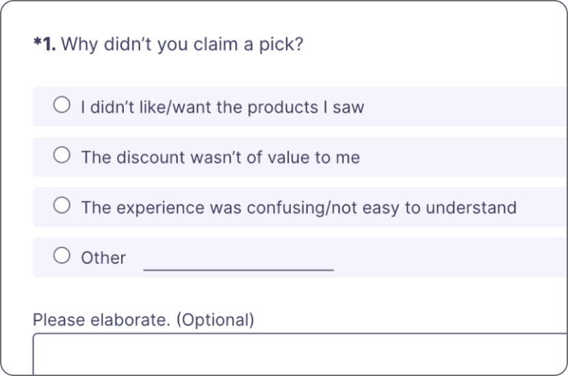
Research Study
Product wanted to know: Will Picks be received well after launch? The purpose of this survey was to gauge their response.
After a couple of months in market, we saw that the MVP was able to cut through the noise and generate meaningful engagement—especially for a brand-new feature. Across September and October, Member Picks drove over 300,000 dashboard visits and more than 8,000 redemptions, signaling strong early interest.
To build on this momentum, my recommendations include:
Improving visibility by placing the component in more locations across the app to increase discovery and traffic.
Enhancing product selection—either through overall item quality or personalization—to boost desirability.
Introducing multi-product shopping options (e.g., add to cart) to reduce friction and improve conversion.