

Field Boundaries
Field Boundaries
A geospatial mapping tool for smarter nutrient planning
A geospatial mapping tool for smarter nutrient planning
A geospatial mapping tool for smarter nutrient planning
Task at Hand
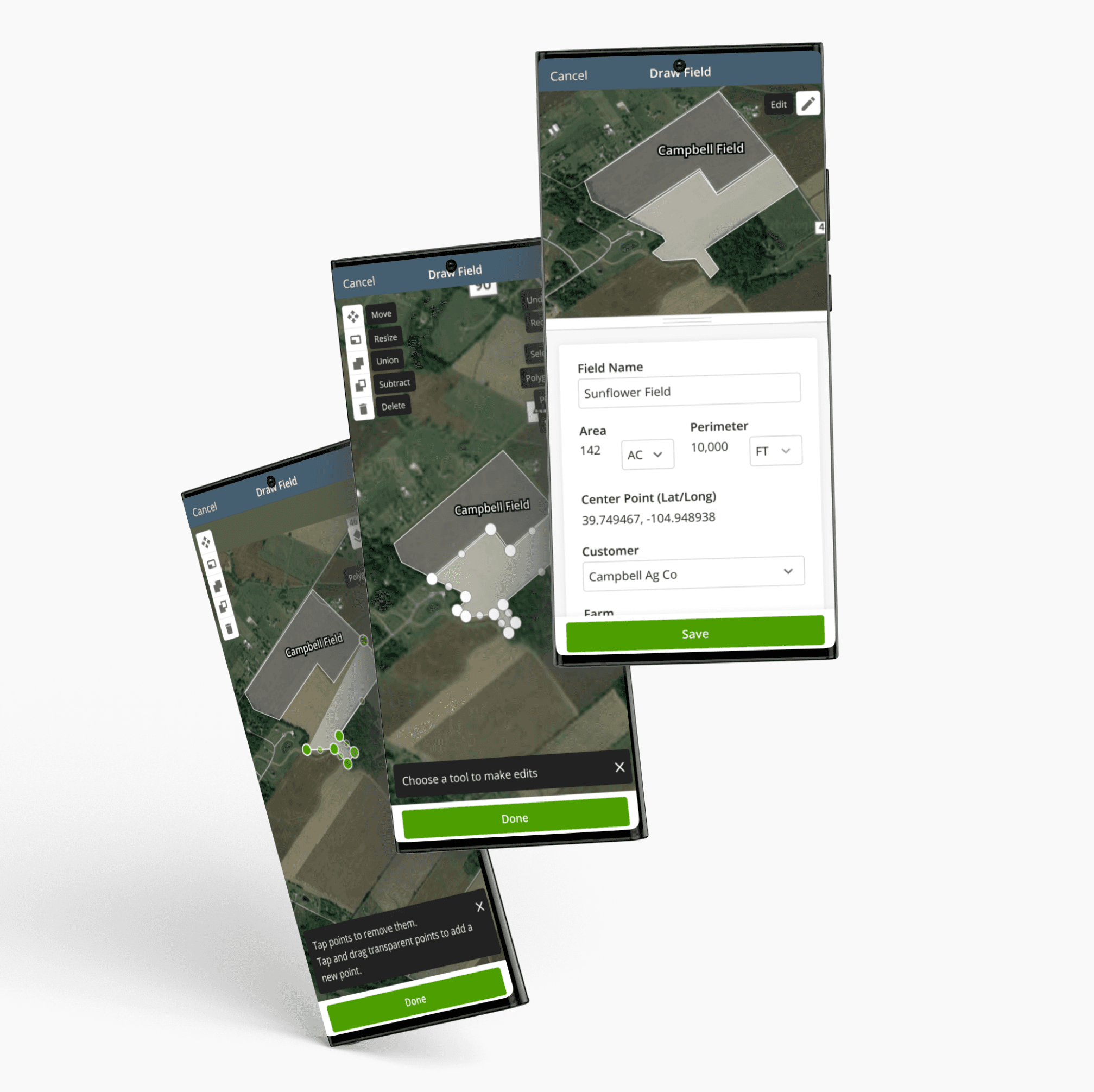
Create a feature that allows users to create field boundaries in the easiest way possible.
My Role
UX/UI Designer
Iteration, Prototyping and Testing
October 2020 - December 2020
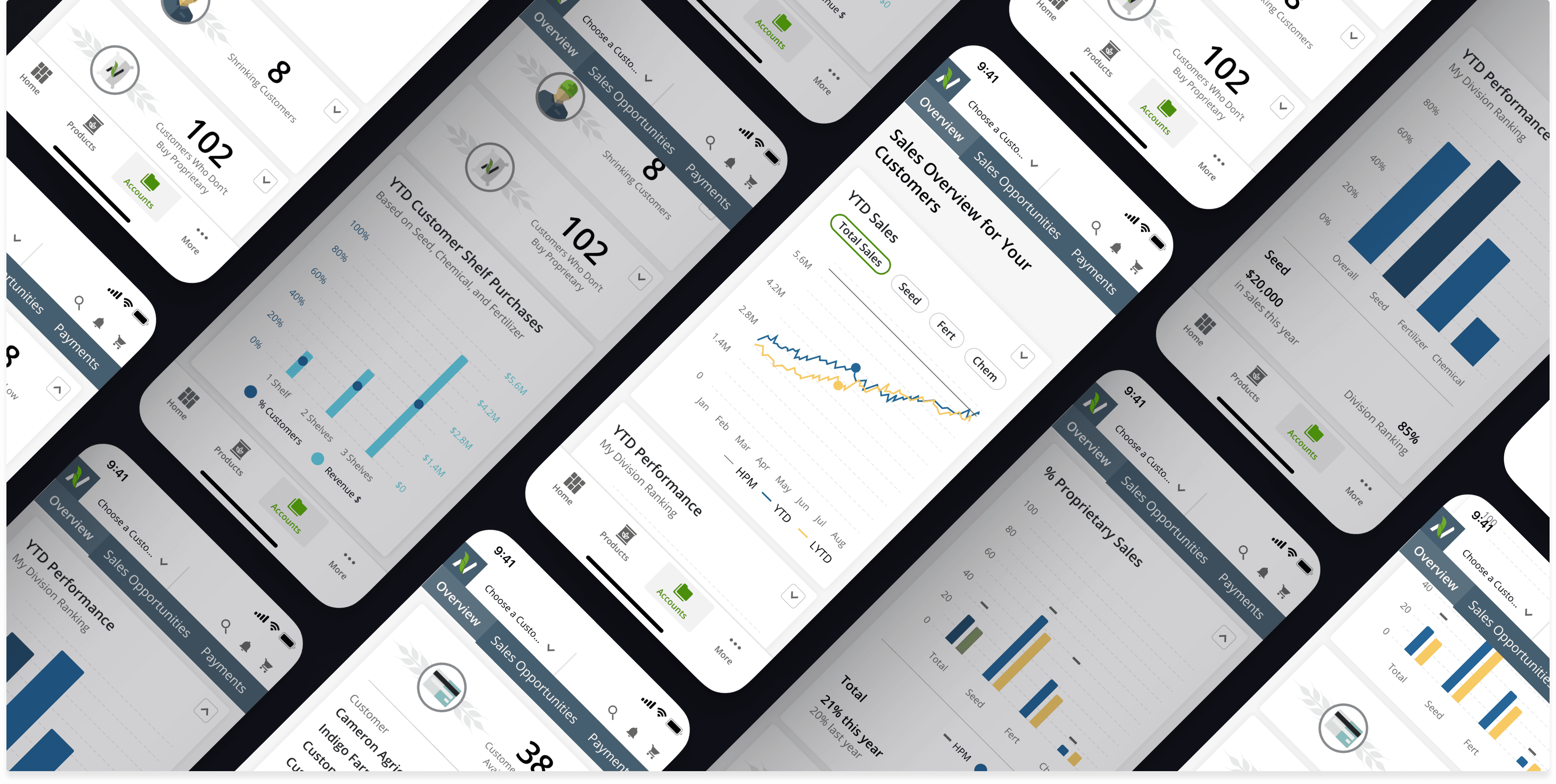
The size of the field is important information in making a sale. The amount of acres a field is a key factor in determining how much product is needed.
Products are applied by specialized machinery that use a field boundary to map its route. Field boundaries in the platform can be sent to machines to tell them specifically where to apply the product.
Maps are also used for precision ag activities. For example, showing “heat maps” to show soil test results and yield performance results. While I don’t directly address this aspect in the project below, this information is also very useful for Crop Consultants in making recommendations about different products and amounts used in specific areas of the fields.
Maps are also used for precision ag activities. For example, showing “heat maps” to show soil test results and yield performance results. While I don’t directly address this aspect in the project below, this information is also very useful for Crop Consultants in making recommendations about different products and amounts used in specific areas of the fields.
Maps are also used for precision ag activities. For example, showing “heat maps” to show soil test results and yield performance results. While I don’t directly address this aspect in the project below, this information is also very useful for Crop Consultants in making recommendations about different products and amounts used in specific areas of the fields.


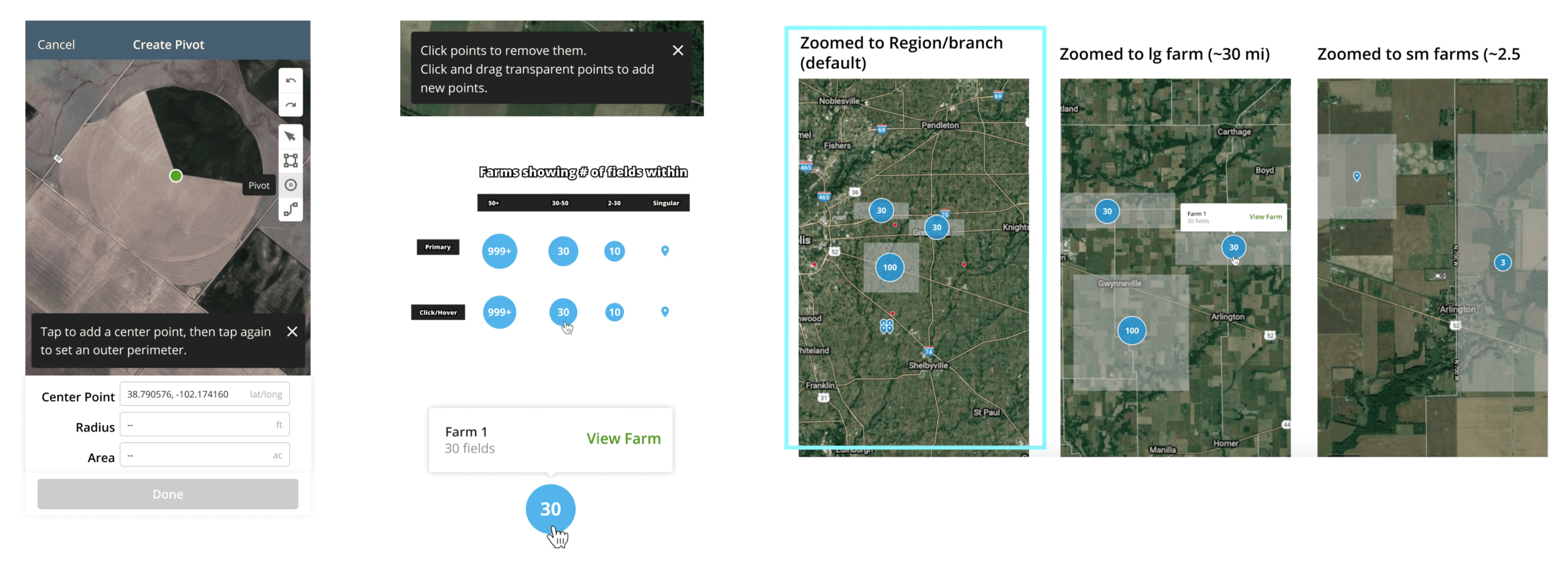
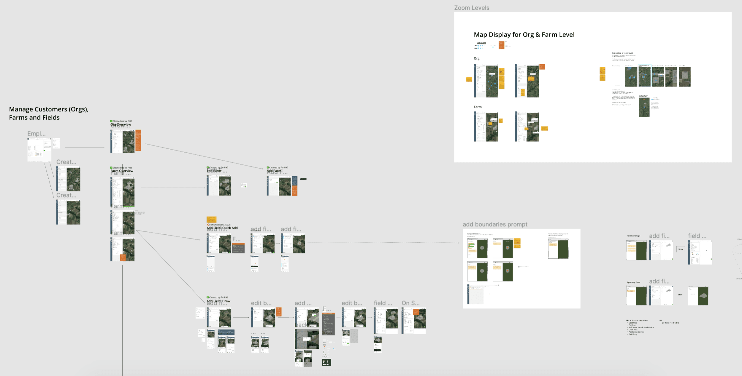
Getting field boundaries into the platform can be done in multiple ways:
Import from 3rd party apps
Import from shapefiles (At times provided by growers)
Select a Common Land Units (CLU)
Draw boundaries manually
Polygons (Any field that is not a circle)
Pivots (Circular fields)
Ability to split a field (for roads and waterways for example)
During this project I worked on all of these, but in this presentation I will just CLUs and the drawing tools specifically.
Design Process
Design Process
Objective + Challenges
The requirements of this feature were to enable the user to draw fields. These drawing tools in combination with the presentation of the map would influence how designers of other features would utilize this set of components and build off of them. The needs for map tools were fairly clear in concept, however the interactions they entailed were quite nuanced.
PART 1: Competitive Analysis
Before designing anything, I tested out similar competitor apps and documented their tool sets and how each of them functioned. Then, I did a competitive analysis by comparing my notes in a spreadsheet. Getting to know the industry standard was helpful to guide us towards what was a must have for our feature.
Additionally, there was a design a previous designer had done, so I had something rough to start with and improve upon.

PART 2: Design Iterations
After completing the competitive analysis I got to designing. After iterating on the designs I presented them to product, engineering and other stakeholders for feedback, and iterated some more.
Check out the demo below to see how it worked.
PART 2: Design Iterations
After completing the competitive analysis I got to designing. After iterating on the designs I presented them to product, engineering and other stakeholders for feedback, and iterated some more.
Check out the demo below to see how it worked.
PART 2: Design Iterations
After completing the competitive analysis I got to designing. After iterating on the designs I presented them to product, engineering and other stakeholders for feedback, and iterated some more.
Check out the demo below to see how it worked.
PART 3: Testing
PART 3: Testing
Because of the nuanced nature of the designs, creating a prototype to test was proving to be difficult. I would liken it to testing google maps, where the user has a range of interactions that can be done based solely by clicking around and exploring. We discussed that building out the designs and then testing them may be the best and most accurate way.
The design that I created was an improvement from what already existed, but not everyone was convinced. Why spend more time developing designs when we have something already? Especially if we are not sure how much of a difference the new designs will make?
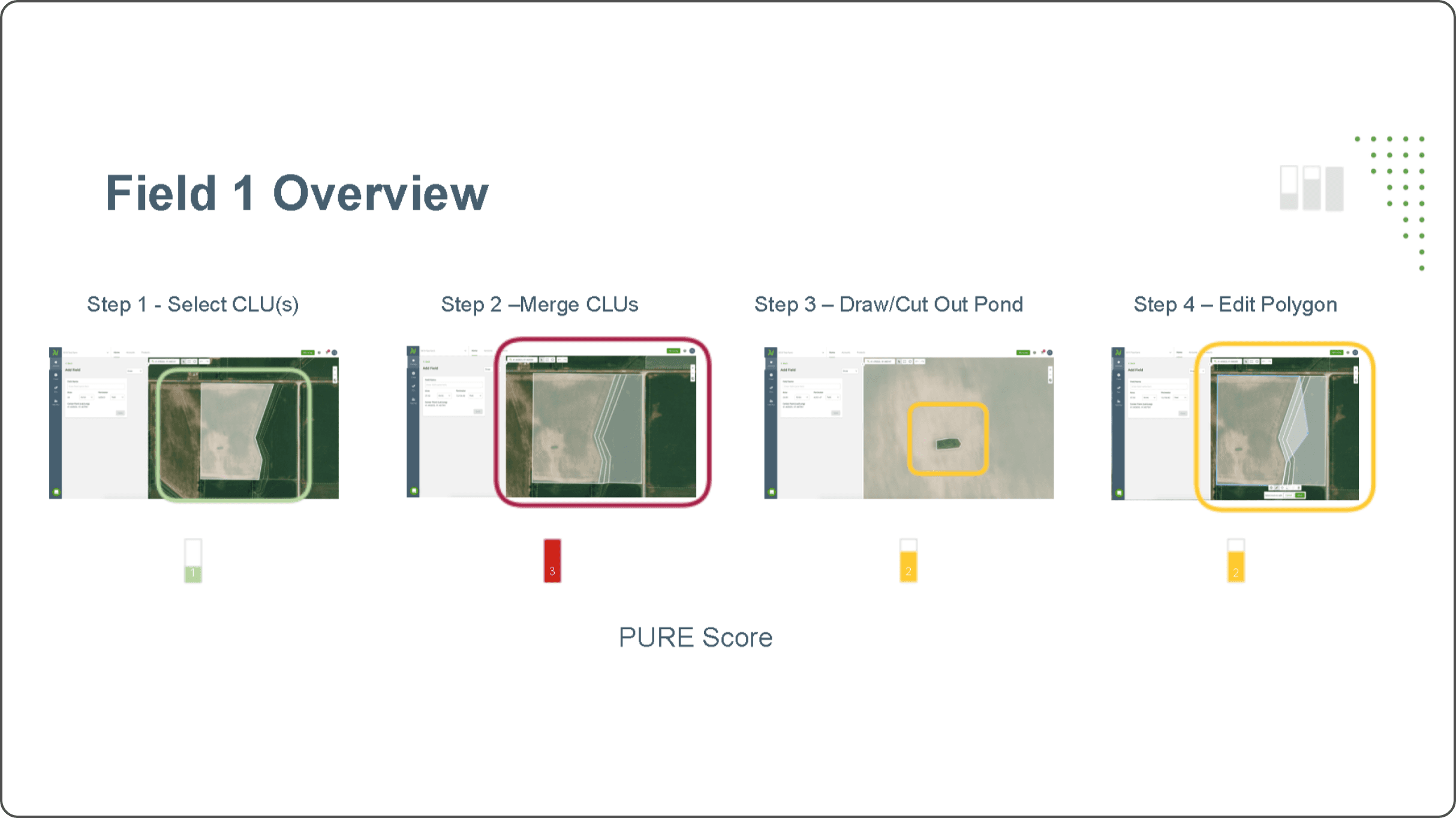
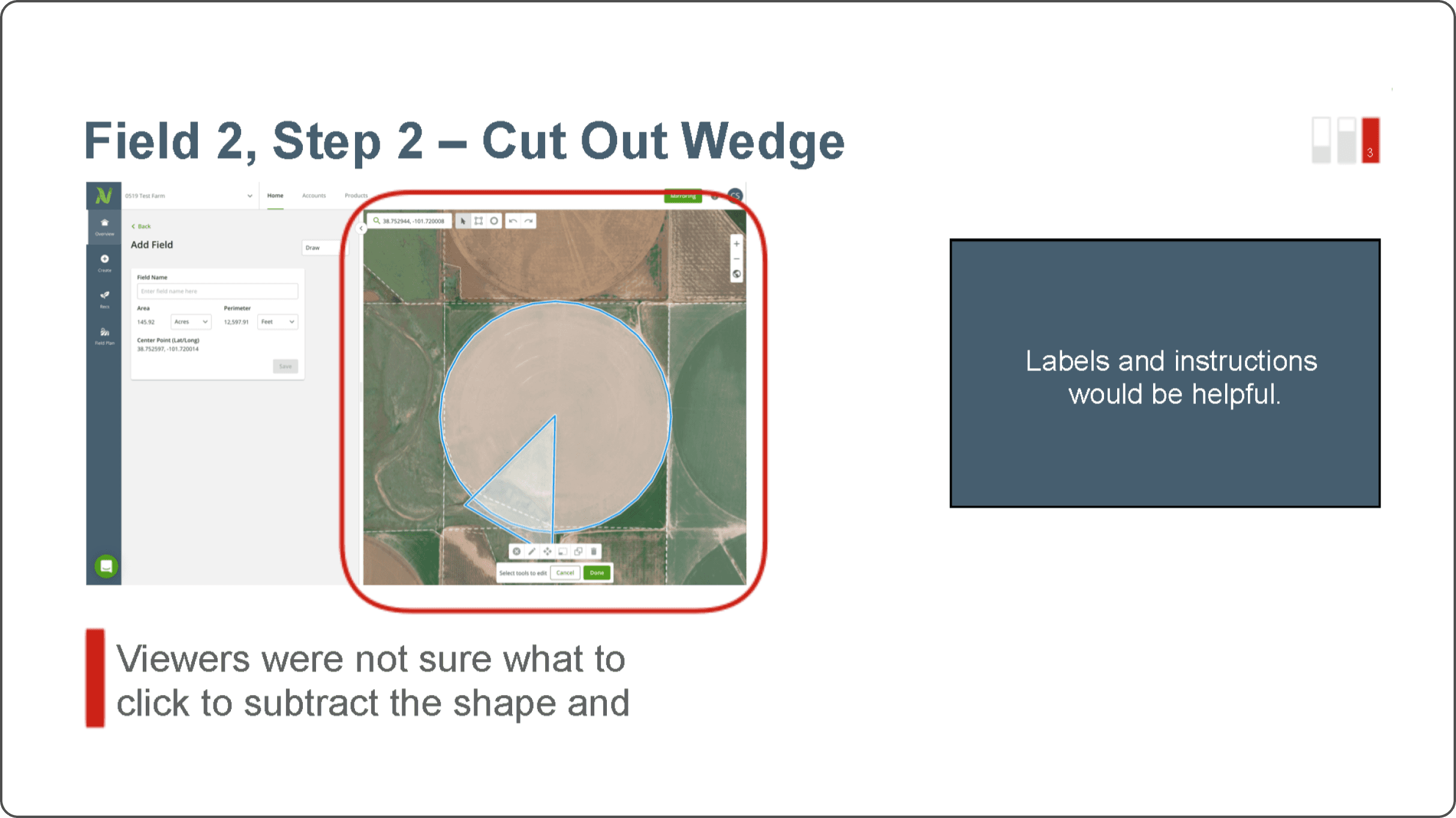
At this stage we decided to do a PURE test.
Because of the nuanced nature of the designs, creating a prototype to test was proving to be difficult. I would liken it to testing google maps, where the user has a range of interactions that can be done based solely by clicking around and exploring. We discussed that building out the designs and then testing them may be the best and most accurate way.
The design that I created was an improvement from what already existed, but not everyone was convinced. Why spend more time developing designs when we have something already? Especially if we are not sure how much of a difference the new designs will make?
At this stage we decided to do a PURE test.
PURE tests help to uncover ~⅓ of issues users would have without taking their time to test. This allowed us to quickly verify what issues needed to be addressed in the existing build. To do this, we walked through the build, step by step with RALs (Regional Adoption Leads-- partners to the Crop Consultant) and asked them to rank the difficulty of each step.
The results: The build scored poorly.There were no labels on the tools, so this helped us prove just how important the addition of labels would be as well as some other details that turned out to make a big difference to the user.

The results: The build scored poorly. There were no labels on the tools, so this helped us prove just how important the addition of labels would be as well as some other details that turned out to make a big difference to the user.
The results: The build scored poorly. There were no labels on the tools, so this helped us prove just how important the addition of labels would be as well as some other details that turned out to make a big difference to the user.
Concluding Thoughts
Concluding Thoughts
Maps are extremely useful for Crop Consultants in serving growers, and field boundaries are a foundational aspect of the feature that will carry over to other precision ag activities. These designs will be the launch pad for those future tools. I really enjoyed working on this project for the interactive nature, but also how it seemed to connect to everything else the user could do. The future of Ag Tech seems to have endless possibilities!
Maps are extremely useful for Crop Consultants in serving growers, and field boundaries are a foundational aspect of the feature that will carry over to other precision ag activities. These designs will be the launch pad for those future tools. I really enjoyed working on this project for the interactive nature, but also how it seemed to connect to everything else the user could do. The future of Ag Tech seems to have endless possibilities!