

Best Buy Membership
Elevating the Member Experience
Elevating The My Best Buy™ Member Experience
While working as a Senior UX Designer at Best Buy, I partnered closely with Product and Business teams to improve how members engage with their benefits across web and app. Our goal was to help members better understand and connect with the value of their membership, ultimately supporting retention.
Rather than a single initiative, this work unfolded through a series of loosely connected efforts (some strategic, some scrappy) as we navigated shifting priorities and evolving leadership direction. This case study highlights how we explored both creative and practical approaches to deliver solutions that aligned with user needs and business realities.
About Best Buy
Best Buy is the largest specialty retailer in the US consumer electronics retail industry.
Best Buy offers a tiered membership program called My Best Buy Memberships™, with different levels of benefits and costs

How might we help members utilize the value of their membership?
We knew from in-depth user interviews that Best Buy members felt that they didn’t get enough value from their membership and that was the top reason why they would cancel.
The problem with the original member dashboard was that it did not help members realize the full value of their membership. Of all the members who visited the dashboard, over half of them did not interact with their benefits.
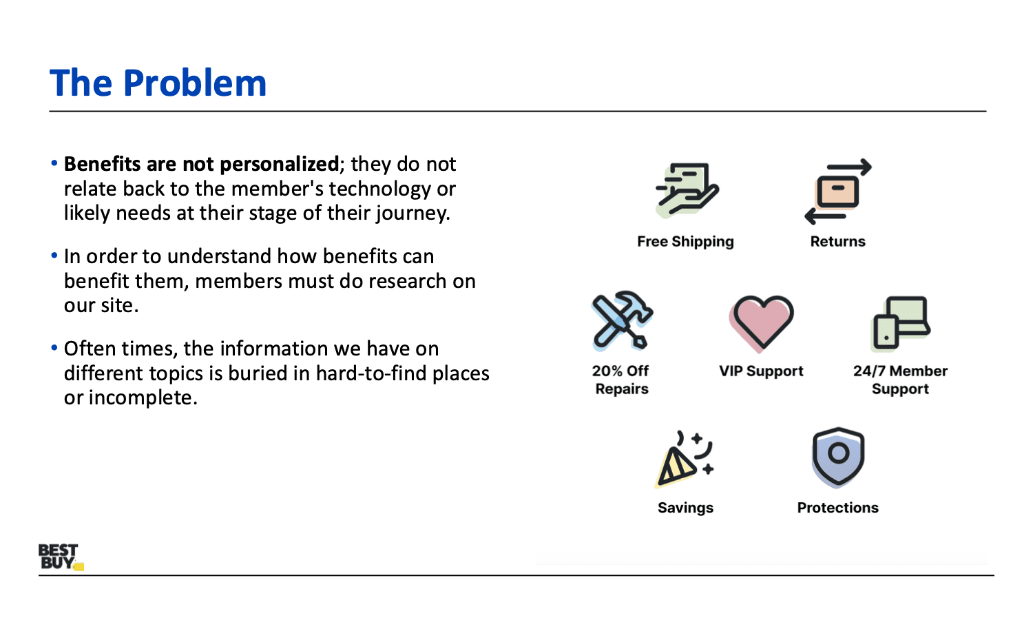
Benefits Were Not Understood or Utilized
The problem with the original member dashboard was that it did not help members realize the full value of their membership. Of all the members who visited the dashboard, over half of them did not interact with their benefits.
A Model to Guide Strategy
After digging into the research, one of my key takeaways was the opportunity to leverage the “Ideal Member Experience Insights Model” to guide our concepts and strategy—ultimately helping members better connect with the full potential of their membership.


Discovery, Context, and Cross-Team Connection
To ensure the team had a clear understanding of all member benefits, I began by gathering detailed information from stakeholders across various teams and roles. These conversations helped clarify which teams owned which benefits and how they operated. Beyond surfacing important context, this also served as an opportunity to build rapport with cross-functional partners who would likely be impacted by the direction we’d take. Since membership decisions often have ripple effects across the organization, early alignment and buy-in were critical. After getting more information about the benefits, we were ready to create solution concepts.
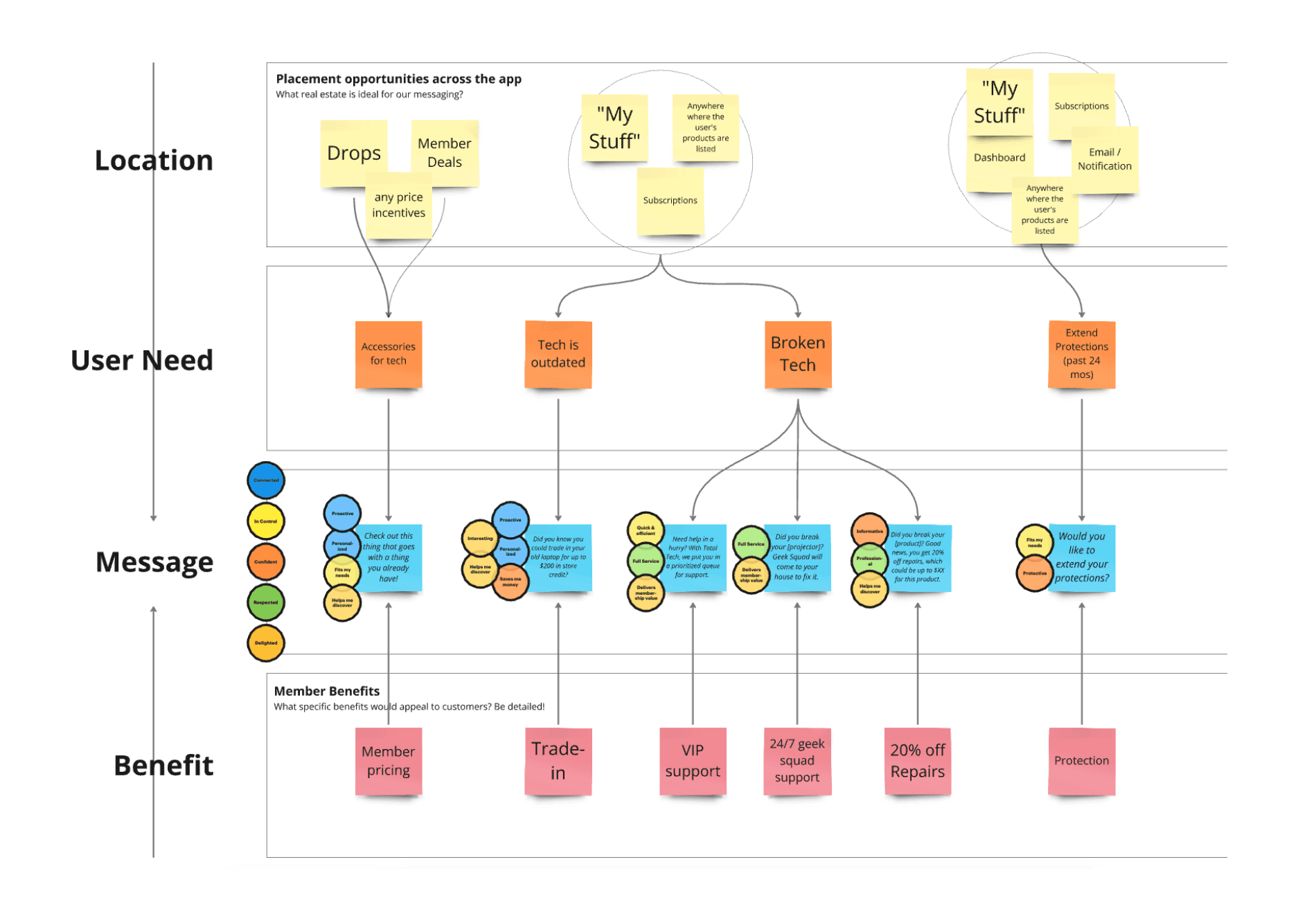
How do we want members to feel?
To ensure that our concepts aligned with the model from research cited above (and thus, user needs) we mapped out different concepts with their corresponding messaging and placement.
~
After collaborating with subject matter experts and teammates, I presented my findings and proposed direction to the Membership Product team—advocating for the insights to be incorporated into their ongoing strategy.
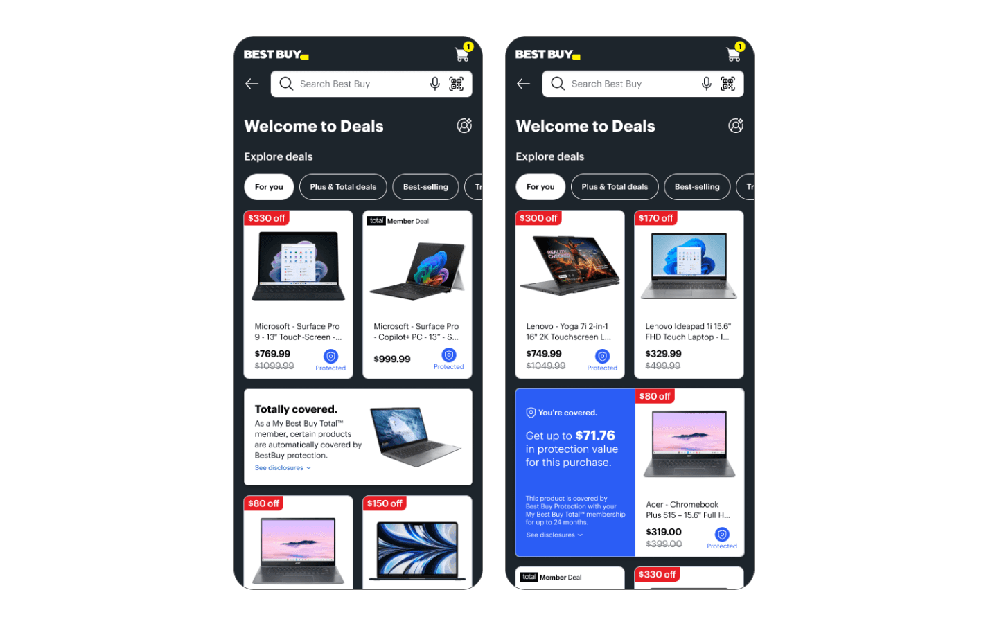
A creative approach: Gamification
Early in the concepting phase, I explored ways to boost engagement through gamification techniques such as progress bars, encouraging messages, and badges. However, after evaluating the effort required versus the potential impact, we concluded it wasn’t the right investment at the time.
A practical approach:
Savings
The first thing a user may notice when they arrive on the member dashboard is the amount of money they have saved through their membership. This is one of the most compelling reasons customers choose to become members.
Despite memberships being available since 2019, no prior research had focused specifically on how users perceive or engage with savings. We decided to focus on ensuring that this information was presented to users in a way that was easy to understand, emotionally resonant, and reinforced the value of membership.
With this direction in mind, I pursued my own user research to help inform how we could update the designs to be their best. Each study focused on the different ways that we communicated savings.
1. Data visualization VS Emotional Messaging
Which type of communication did users prefer? Is the content easily understandable?
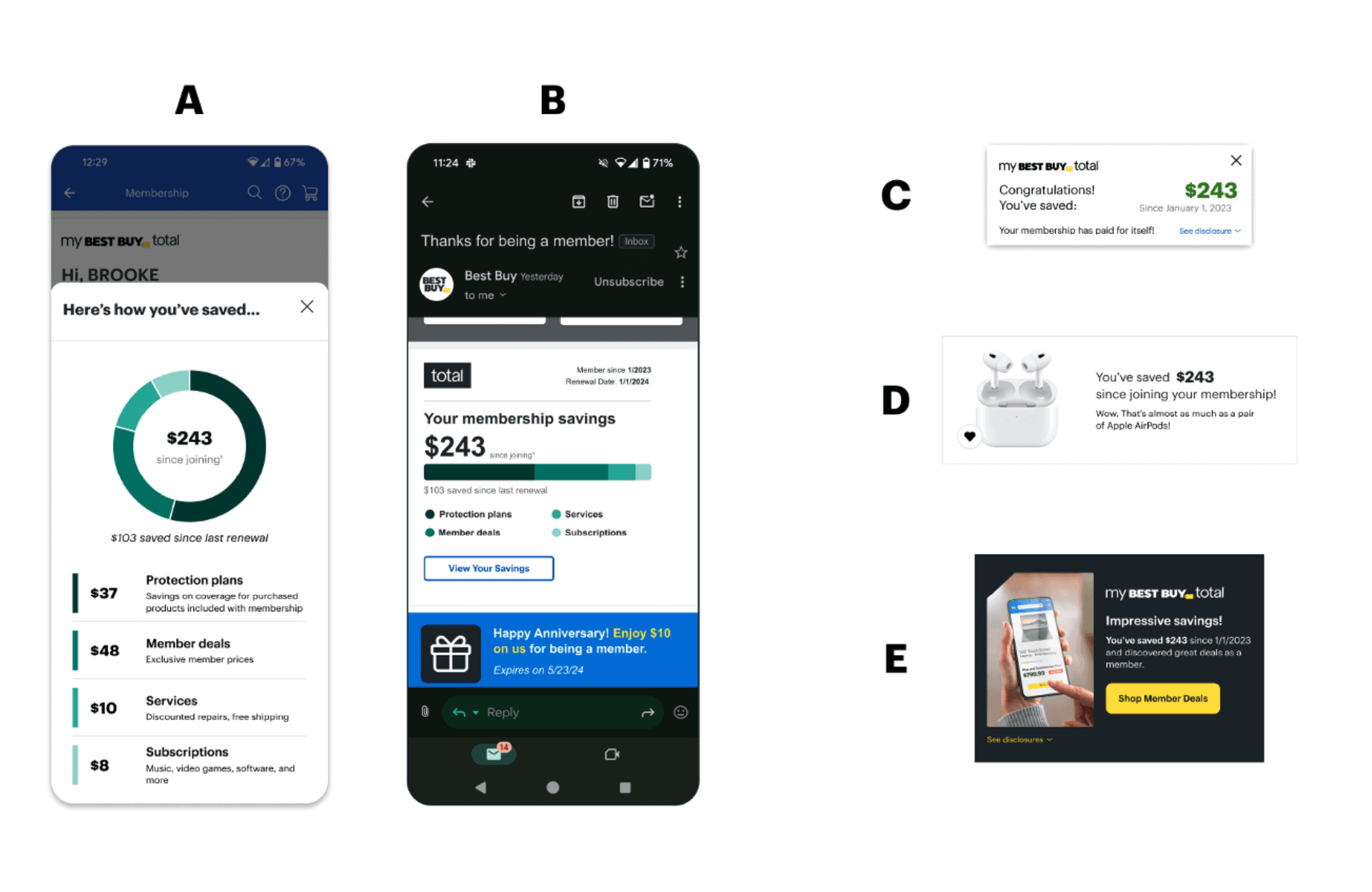
2. Protections savings
When talking about savings as it relates to protections, what type of messaging resonates with users?
~
With the data we gathered from the research studies, I was able to move forward with updating the content strategy for savings over all.
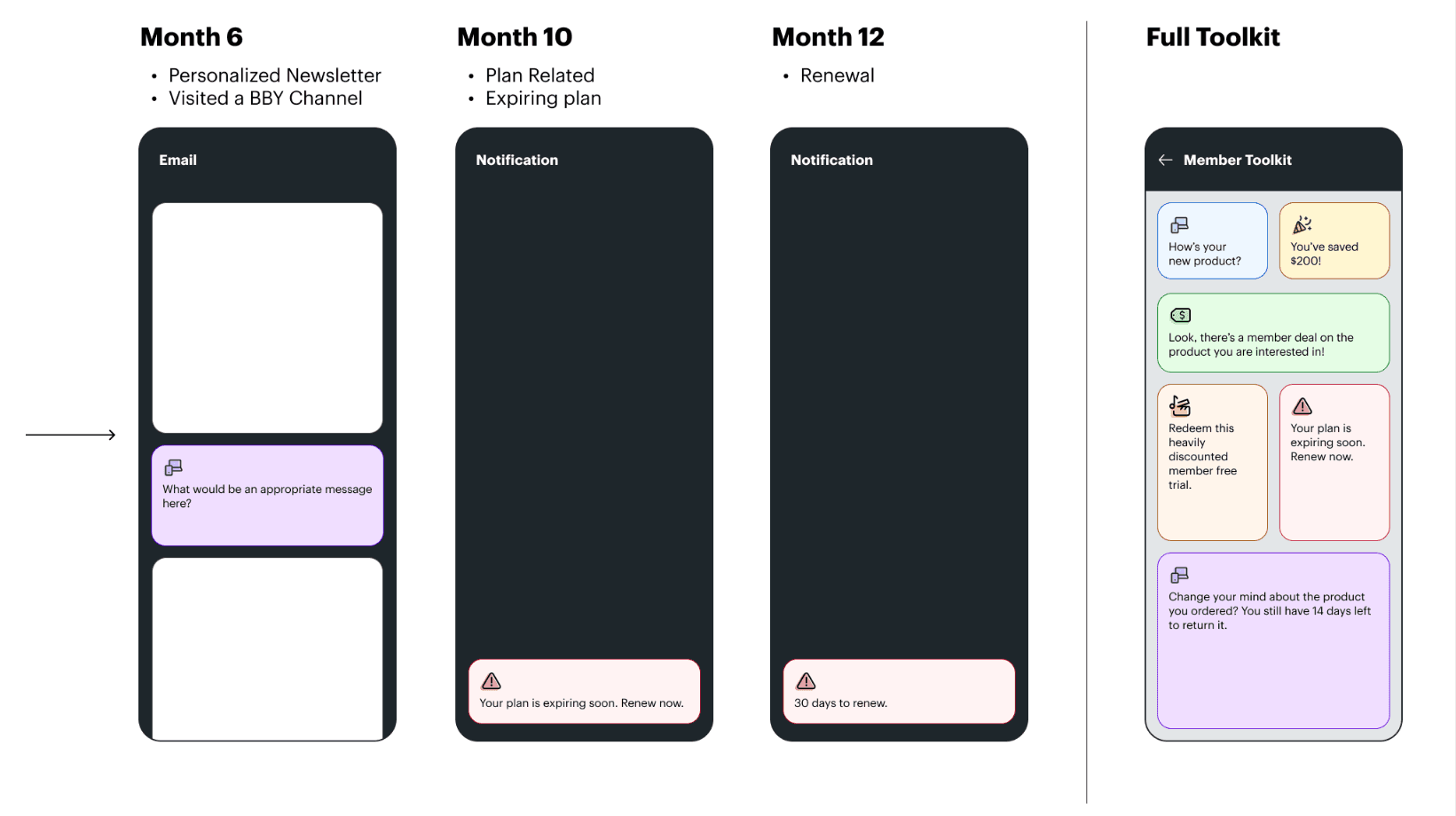
A creative approach: Member Tool Kit
The goal of the member tool kit was to surface the right content to the user at the right time, in the right place. For example, letting a user know that Best Buy will replace the screen on their new phone if they crack it. While there was a lot of opportunity for membership-specific personalization, and while it aligned with the user’s desires as cited in the research, it was at odds with the amount of development resources we had. (not enough)

A practical approach: Update to the dashboard
While a more holistic strategy was not approved, there were still improvements we could make that would take less development effort.
Streamlined Aesthetic
Over the years, the member dashboard had been added to without much thought about streamlining the layout and its components. Some simple visual tweaks made all the difference in creating a sleek, professional looking layout.
Removal of clutter
Sometimes less is more. We removed any content that was not serving the user or was included in the new, updated benefit cards. We removed free trials, the app ad and the spreadsheet with computer service prices.
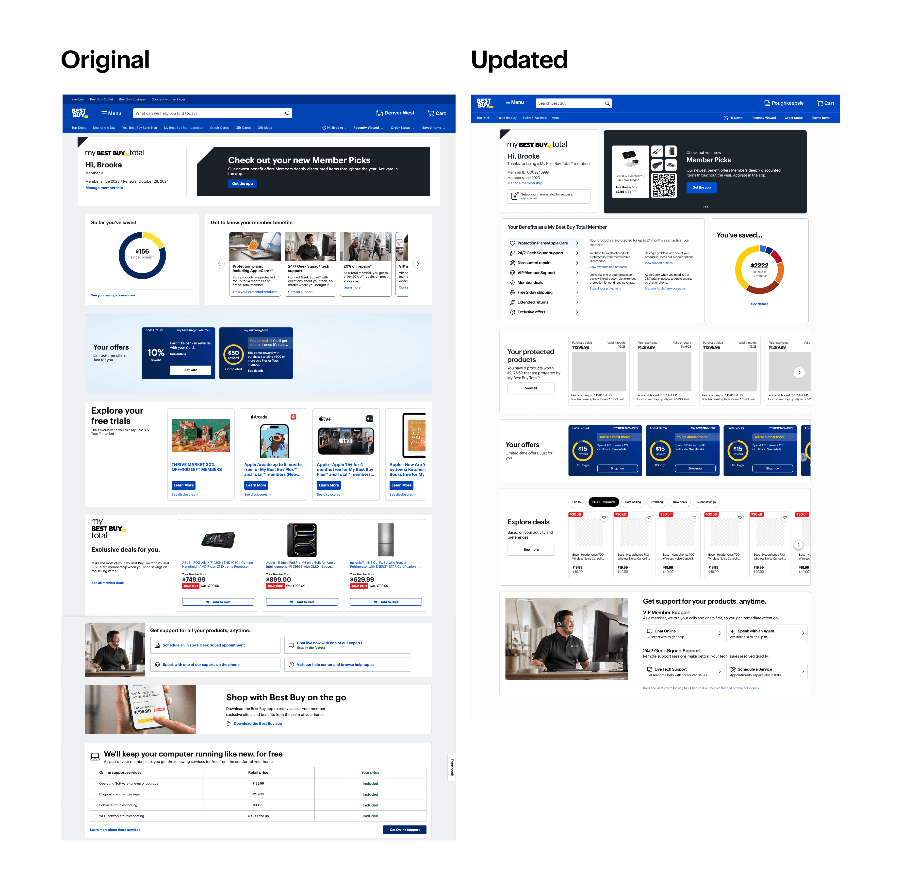
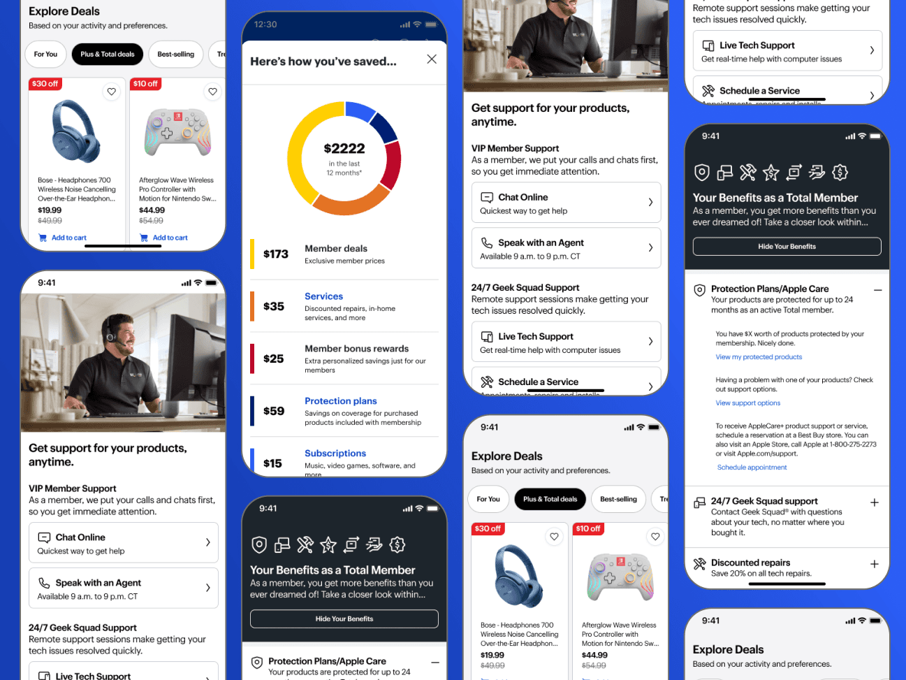
Updated Benefits cards
The existing benefits cards were too high level and did not take users to the relevant pages that one would expect. Overhauled and got approved for implementation
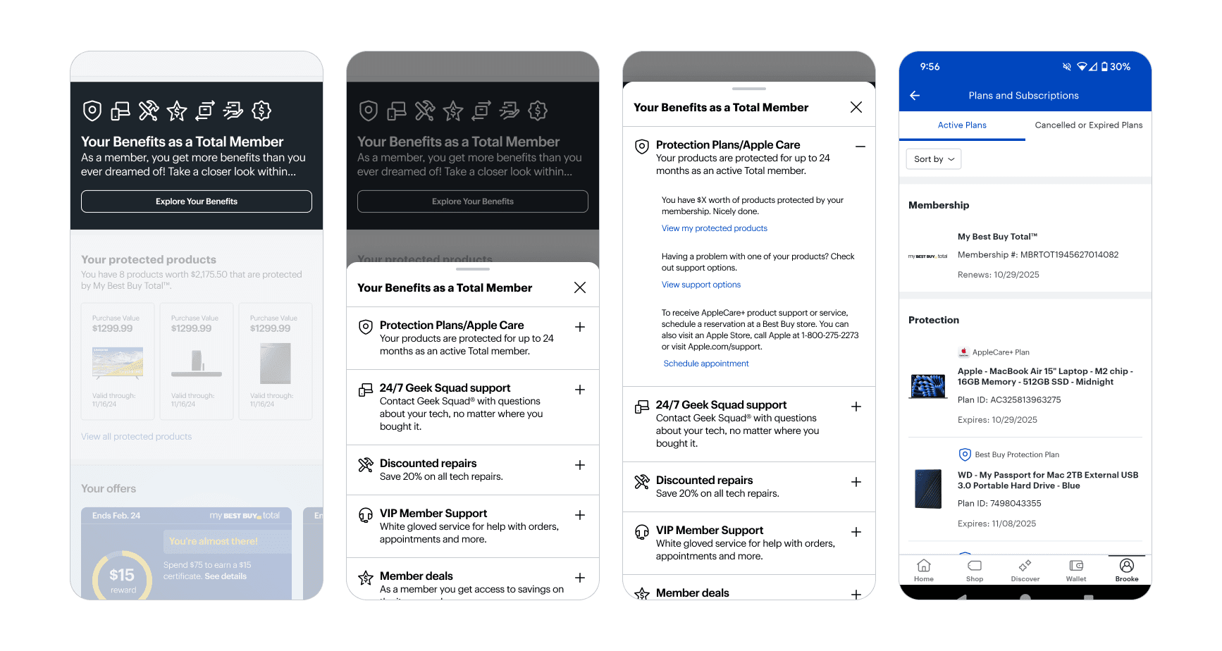
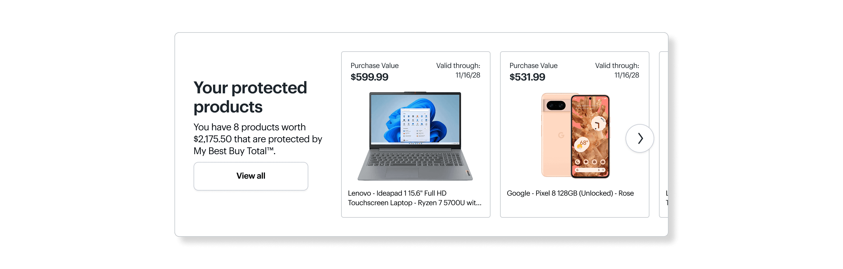
Added Protected Products Component
Product protection is one of the most valued member benefits, but there was no way for users to make an immediate connection between their membership and those products on the dashboard. Adding a component to show the products and their protection value was a no-brainer.
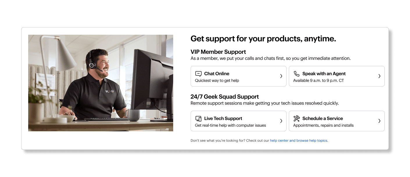
Updated Support Component
The previous version did give users ways to get in touch with support, but did not express how the service related to the membership. We expanded the component to communicate this.
Closing Thoughts
Though the work wasn’t always linear or fully implemented—due in part to changing priorities and team restructuring—it offered a valuable opportunity to push forward user-centered improvements in a complex, evolving environment. I stayed focused on what mattered: making membership benefits feel clear, meaningful, and worth engaging with. From user research and strategy to hands-on content and component design, I helped create a more cohesive experience that could scale with future needs.